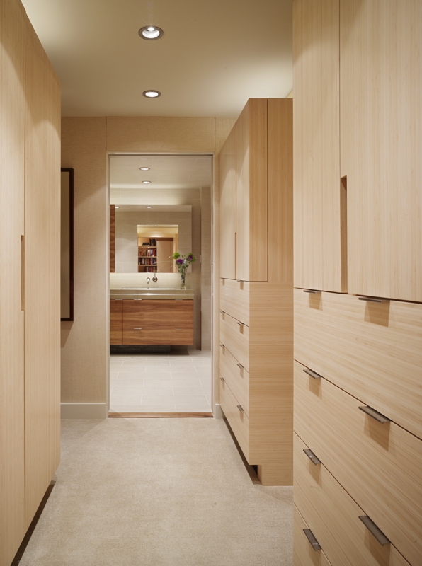
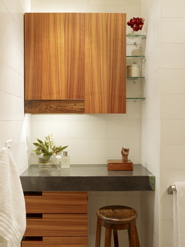
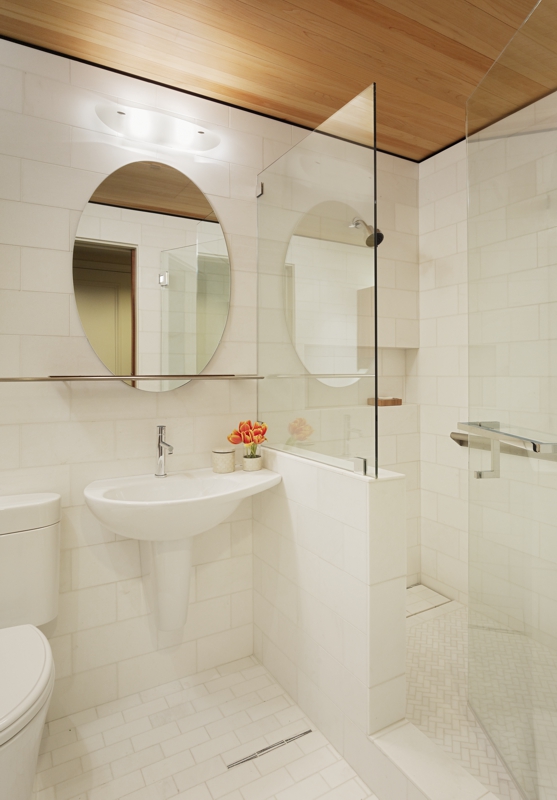
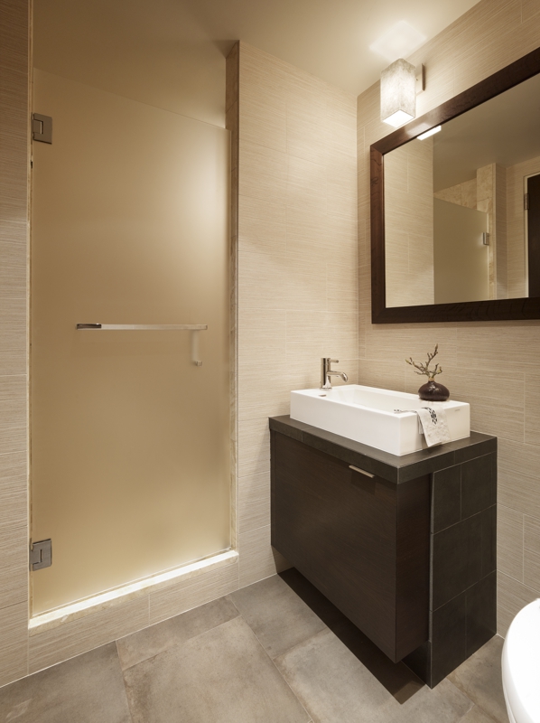
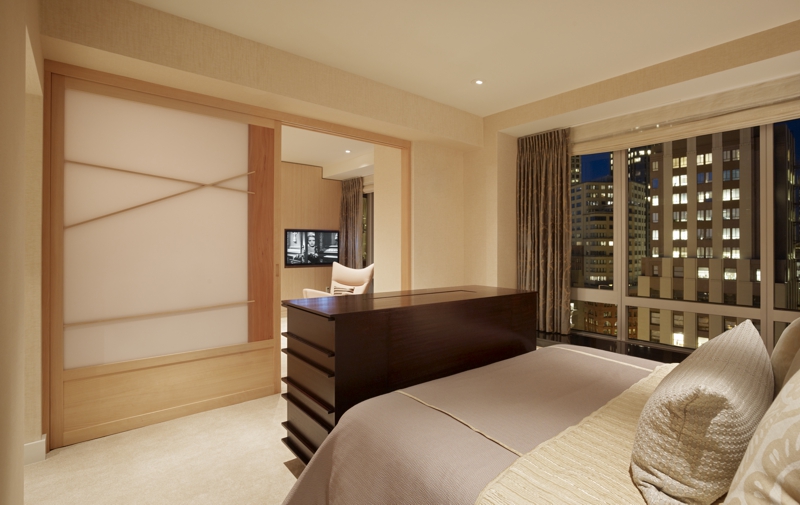
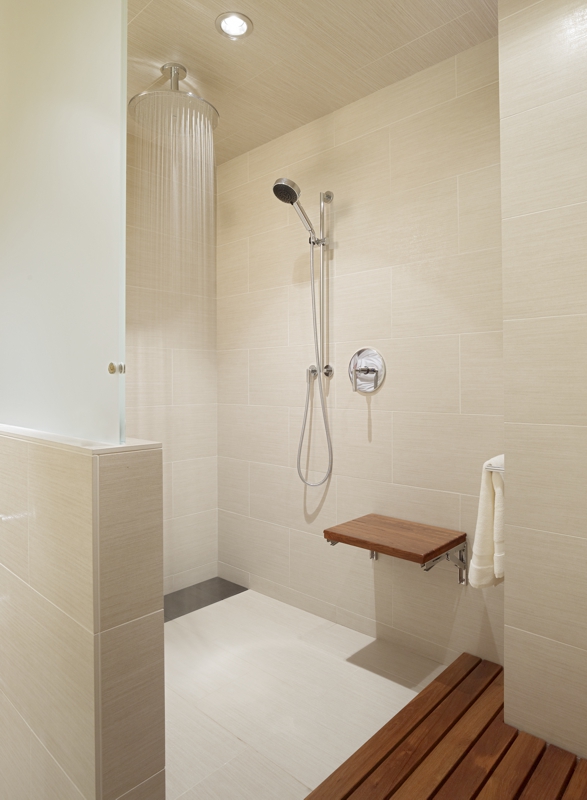
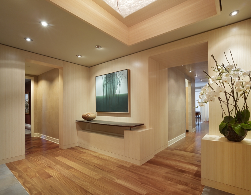
FuTung Cheng and his design team were asked to bring a fresh perspective to an otherwise traditional, high-rise condominium remodel located in the heart of downtown San Francisco. The main goal of the project was to combine two units into one view-studded home. Areas redesigned included the entry foyer, kitchen, bath, and creating a new master wing with bedroom, bathroom, library and walk-in closets.
Project Scope: Remodel of a high-rise luxury condominium
Building Materials Highlights: Reclaimed koa, river-washed granite, raw steel, 3form translucent panels, custom ceramic tile, Mexican pebble tile, cedar, and CHENG Countertop Pro-Formula
Pro-Formula Colors: Sand, Stone, Olive and Charcoal
Project Location: San Francisco, CA
A CHAT WITH FUTUNG
What was the biggest challenge of this project?
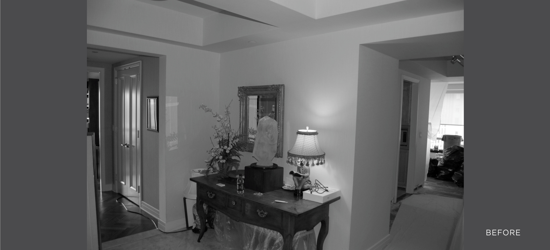
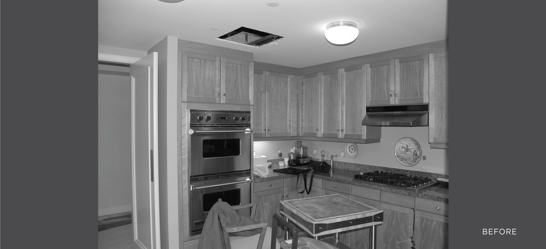
Well, to begin with, the client was scared of “modern.” So the project was about taking a more traditional aesthetic that utilizes a lot of molding and paint and wallpaper to create interest on the surfaces and instead we reconfigured the spaces for better function, design and flow and made surfaces more tactile and warm with wood finishes. That was the first step in the overall approach.
Why did they come to you if they were scared of modern?
The project came through the contractor. At first, the client couldn’t see the aesthetic continuity—that the strengths of traditional style that speaks to them—like craftsmanship, quality and warmth, sense of proportion and scale—could work hand-in-hand with that of modern characteristics like the fresh way of looking at materials, thinking about it and using it, the new idea of luxury, composition and intentional use of open space.
I had to work hard to make them understand that you can take the application of all of these strengths and create a feeling of how “clean” it all can be. With a modern touch we can create areas of calm and areas of excitement through materials with a modern flair that pays homage to the traditional…and I think we did just that for them.
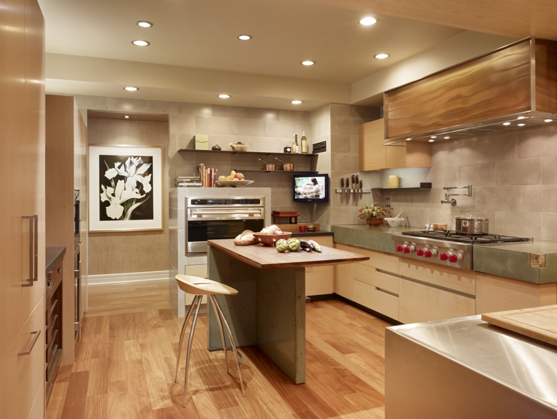
Seems like the kitchen got a major facelift, what are some key ideas here?
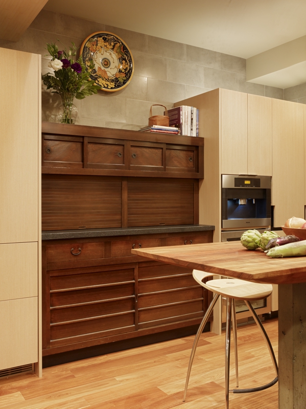
The client has an appreciation of antique things and the quality that comes with antiques. I wanted to honor that and had this vision for using a tansu chest as a major piece for the kitchen. It’s ideal because: the scale of the tansu is based on multiple levels of functions with several layers of storage. It lends itself to compartmentalization.
To modernize its use, roll up doors and pull-out drawers were added and a new surface slab of river-washed granite was installed; it’s a perfect example of something that is antique with strong history brought into a modern functionality with just subtle changes in detail.
The almost-not-so-funny-thing was that I designed the kitchen and created space for a tansu that would be centered in the kitchen BEFORE I found the perfect tansu! I had already designed the space and so there was a set measurement for the right tansu to fit into this area as I thought that was a typical dimension, but what’s typical about antique things, right?
What luck! I go to my favourite place to buy Japanese antiques and I found one that was within ½” of the space allotted. I thought there were going to be a lot to choose from and turns out that this was the one. First one from the first place — too good to be true, but it was the one! Whew…
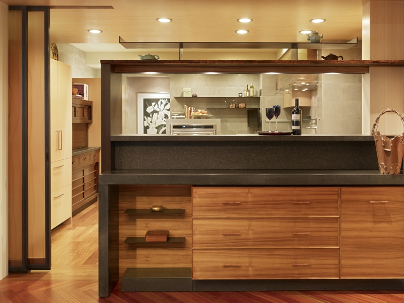
That seems like a close call! The rest of the kitchen seems to have a lot of detailed nuances, can you describe a few?
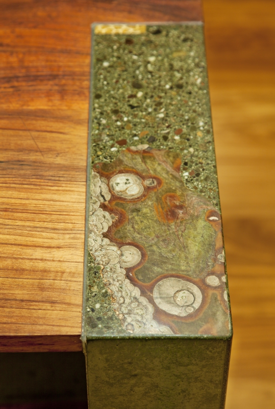
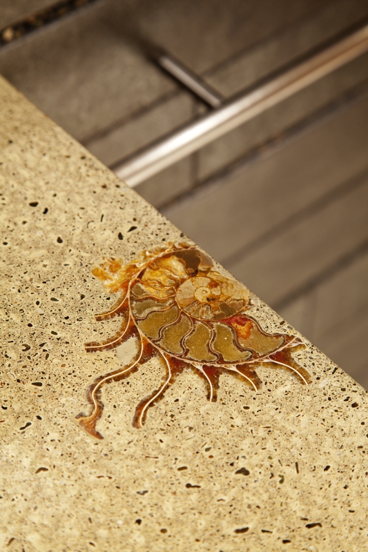
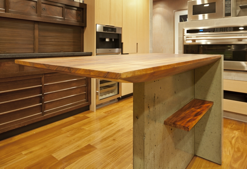
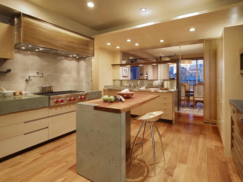
The client’s husband sits at the island while she cooks and they watch TV. It had to be comfortable because he’s really tall. The reclaimed koa wood island top swales down like a boat-bottom in a sensuous form allowing it to cantilever which allows for more leg room and movement. There’s a beautiful piece of petrified coral integrated at the corner, which is such a special little find—the colors are perfect.
Just beyond the island is the sink area which is where a wall existed, but the idea was to open up the space and bring the cityscape view from the kitchen. It’s dramatic with the natural light now feeding into the kitchen. On the other side of the sink area is a raw steel shelf and a built-in formal dining buffet featuring Charcoal-colored surface wrap. There’s hidden sliding doors that separate dining from kitchen for more formal affairs.
And the 3form translucent panel that is seen in the kitchen hood is the same material as the sliding doors. There’s a hidden spice cabinet behind ceramic tile at wall to the right of the stove. There’s a lot of hidden gems that upon closer inspection, you get these great little aha moments.
There are a lot of various materials you just described, any other interesting material call outs?
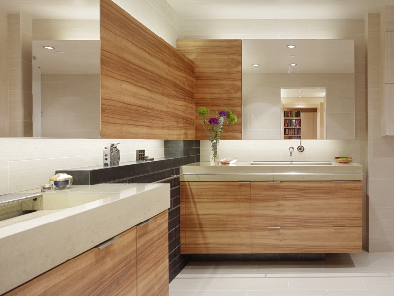
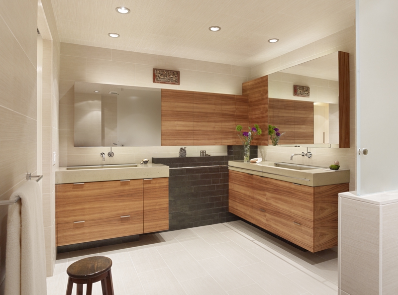
In the master bath, we used reclaimed koa, and black subway tile detailed with Mexican pebble tile. The his-and-hers vanities are a modern interpretation; they’re not a side-by-side traditional dual vanity. They’re done with our Sand-colored Pro-Formula. There isn’t any hardware for the uppers, which keeps the lines clean, but all done in warm woods.
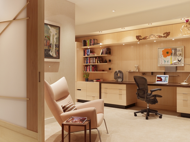
Cedar was used for the modern take on the 10 ft. wide shoji panels in the bedroom. Again, here’s taking traditional classical ideas with a completely modern interpretation. Bamboo was used in the study’s shelves, but with hints of metal details.
What is your favorite area or “aha moment” of this project?
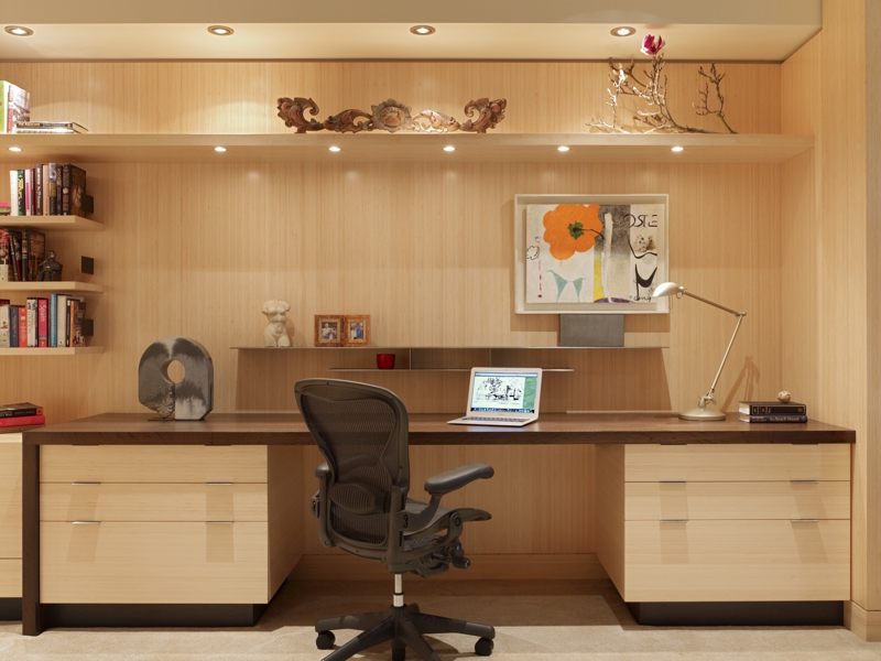
I really enjoy the experience of walking into the space from the outside of the building—it’s like a completely fresh palette, a breath of fresh air. I like distinguishing it from what it looked like before. Favorites include the kitchen island area, the desk in the study, and I liked the bathroom and how it really came together.
It’s great to deliver the client with something she didn’t expect going into it, but coming out of it with a lot of trust in our design process and she loves living in her new space—so much so that they’ve hired us for another project!
